Evaluation

Overall I feel that this brief has been very successful in the fact that the intentions that I set out with have been achieved.

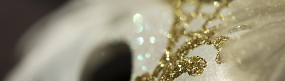
When I started this work I was not 100% sure where I wanted to end up, in fact my initial ideas were to continue on with my previous brief exploring the idea further but using sparkle and glitter as my main themes to represent the glitter of the sea. As I started producing these black and white portraits with glitter and shadows my ideas started to move further and further away from the original sea project. Although I was happy with my portraits I didn’t feel inspired to move my work on further and due to this I decided to step back from that idea and look at something new.

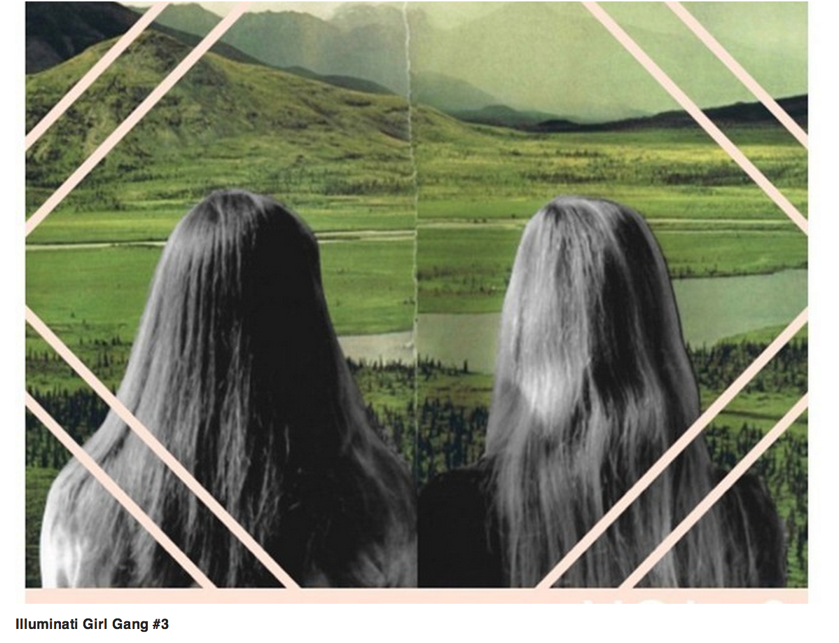
When I had taken a step back I realised that I wanted to take a different route and decided to use aspects of the sea brief but instead of looking at the sea I wanted to focus on identity. I based all my ideas around the theme of carnivals. This was an obvious choice for me as a carnival is very much a way to become a different person, to be who you want to be for just a day.

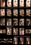
I took some of the original styling ideas from the sea brief for example the idea of using the glitter however, when using the glitter in the carnival images I used it to signify the magic presence surrounding carnivals. I also decided that I wanted to solely focus on portraits and the representation of the make-up. This in turn led me to thinking more about religions and paganism to be precise. As stated throughout my brief paganism is very much about being one with earth and spirituality. I linked all the work together by focusing on the Birds of Paradise flower representing freedom and exotic nature, the carnival and the make-up showing the identity and paganism tying the two together. I also used colour theory to inform my makeup decisions using white to represent showing all your real identity to the world and I used black to signify wanting to cover up who you really are.

When photographing the models I wanted to take close up macro shots so that the viewer becomes part of the image and feels asif they are actually at the carnival next to the model. I made sure that in the backgrounds of the some of the images there was slight resemblances of the environment to place the model in the location that she would be seen making the image more realistic.

When looking at the images as a whole body of work I am very happy, I think they flow together nicely and work well to create a story for the viewer to follow. If I was to change anything I think I would probably use more models and create a wider variety of makeup so the images all look different but have a similar theme.

My finished zine

This slideshow requires JavaScript.

This is my finished zine. I worked with a graphic designer to design the layout and then once printed I stitched the finish book together. I plan on printing a lot more of these zines so that I can take them to my exhibition and hand them out to potential clients.

Top ten zines

Along side my portfolio I would like to hand in a zine as well. This is to potentially use to hand out at my exhibitions. A zine is a quick and easy way to showcase a lot of my work with it still looking effective. Due to this I decided to do some research into zines that already exist. Below I have included an article from Dazed and Confused magazine.

Bound & Flogged: Counting down renegade publishers and the best of DIY print culture

Screen Shot 2014-05-14 at 11.28.31


OK, so perhaps the idea of the zine, at least in the traditional sense, runs inherently counter to that of a top ten list. Small-circulation independent magazines thriving at the local level, distributed by word of mouth and happenstance – ranking them seems a bit ruthless, not to mention impossible.

And in an age when great swathes of humanity can be summarized in a hashtag, it’s unclear what even counts as a zine anymore. Where the Doc Marten-wearing enthusiast of yesteryear depended on chance discoveries in their local independent bookstore, coffee shop or illegal underground roller disco/feminist artist collective, her contemporary counterpart can do a little Googling and have myriad beautiful independent magazines delivered directly to their door – or just scroll through their Tumblr feed for a few hours. Here are ten that caught our eye recently.

The illuminati Girl Gang

A feminist zine that manages to harken to its riot grrl roots while maintaining a twenty-first-century vision (and social media presence), IGG publishes art and writing and aims to act as an oasis in the dick-desert that is publishing today. There’s a reason we’ve mentioned them before.

Screen Shot 2014-05-14 at 11.29.54

Pogo’s Berlin-based small-run publishing operation ‘believes in a future printed on paper’. Published in August, his ‘Archives’ series – five Risograph issues each printed in a batch of 100 – juxtaposes history with history to construct a visual narrative that is itself reminiscent of a past in print.

Screen Shot 2014-05-14 at 11.31.07

Reading someone else’s email – not that we would ever – is at once both heart-racingly illicit and surprisingly boring. Like Miranda July’s We Think Alone project, Post Comment Below’s Kelli Miller and Kendra Eash curate others’ virtual interactions to create a striking, funny and very real picture of communication in the Internet age. Issue #3, Sex, Drugs and Robots, came out in July.

Screen Shot 2014-05-14 at 11.32.19

Rigorous research, design and editorial vision – doesn’t sound that sexy, but human details peek through the crisp layout. Although production is Tokyo-based, editors Yoshi Tsujimura and Cameron Allan McKean deny Too Much is anything but international. Bonus: their tagline, ‘Romantic geography’, looks great on a t-shirt.  Screen Shot 2014-05-14 at 11.33.26

Some literary journals look like shit; this one doesn’t. Issue 6, due out between the end of September and the beginning of October, comes in seven different versions, each edited by a pair of editors who were strangers until they united over themes like endlessness and the ‘shapes of words’.

Screen Shot 2014-05-14 at 11.34.40

Arty photos grapple with aesthetic issues, but sometimes you want ‘jokes and blokes’ alongside your socio-historical cultural critique. Pink Mince is the best kind of DIY – the kind that looks really good – and each issue consistently balances the sassy with the serious to examine its theme from all angles.

Screen Shot 2014-05-14 at 11.35.51

This might not be a zine—its editors don’t know either. The full-colour, large format free-for-all is packing big names (from Chloe Sevigny to Joan Crawford) and does whatever it feels like, calling itself an ‘object’ and maintaining a commitment to ownership and materiality.

Screen Shot 2014-05-14 at 11.36.39

Illustration without intention can sometimes seem cutesy. The bi-annual Limner Journal and its publisher Studio Operative want to change this. Since we last saw them at the South East London Zine Fest, the editors at Limner have been busy fostering discourse on illustration theory, practice and education.

Screen Shot 2014-05-14 at 11.38.20

The Pentaprism series from zine-turned-publisher Hamburger Eyes collects work from 18 photographers and ‘image makers’ to push the limits of both the zine and the black-and-white photo, ideally making the viewer question both the image itself and how to interact with it.

http://www.dazeddigital.com/artsandculture/article/17205/1/top-ten-zines

Mask images

I wanted to incorporate actual costumes in my work so to do that my idea was to photograph masks that could potentially be seen in carnivals. I wanted my masks to link in with my other shoots and to do that I decided to use the theme of glitter I have been carrying throughout this brief.

I am really happy with these images but as stand alone work. I love the way the jewels sparkle and glitter creating a magical aura around the photographs. I do not however think that they fit with the rest of the work I have produced for my brief. This is mainly because they seem to be for a different carnival than the one that I am shooting for. They have more of a soft, venetian feel to them which doesn’t really work against the hard, raw style of my other images.

Dark carnival make-up images

Once again I was using the male shoot that I did first as an inspiration. I have also pulled from paganism and obviously carnivals. I used the same ideas as I used when shooting the model with white paint however, by using black paint I was trying to draw upon the dark side. Black is the darkest colour possible which is why I chose it. It is literally the complete opposite of white meaning a complete absence of light.  What black hides white uncovers. The colour black represents the hidden, the unknown and therefore can be thought of as a mystery. Black can hide who you are much like a carnival can, you are free. When you are in a carnival you can literally be whoever you want to be, that means you can choose. In a way you can choose light or dark. This is the representation of the white and black paint on the models. I wanted to show the two sides without being completely obvious.

I am really happy with my final images and feel that they flow together more with the rest of my work now. I think my strongest image from the shoot is the close up of the eye mainly because it is so close it feels asif the model is popping out of the picture to come into reality.

Carnival beauty shoot

When I looked at my images as a group I realised I wanted the make-up on the  models to link more. I felt really strongly towards the male model shoot as I found those images worked the best. Due to this I decided to alter the females make-up to relate to these ideas. These are my finals from my first shoot in this theme.

When I was shooting I had references of paganism and my original male shoot in my mind. I wanted to make my models more masculine without taking away all of their feminism. To involve the viewer more I used a macro lens to get really close to the model, I feel this creates the feeling the model is right there not just in a photograph, it draws the viewer into the magical, surreal world that carnivals create. In a carnival you can literally be who you want to be and I am hoping to create that feeling with my work. I have continued using glitter to link everything together and glitter tends to sparkle which gives the sense something magical is happening.

By using the white paint I wanted to signify pure freedom, white is the colour of perfection. White can also signify innocence, it represents new beginnings and a fresh start. It opens up the mind for creation. I used white here to represent the complete opposite of black. I wanted to show how the carnival could be a way for someone to be who they really are. To have that new beginning and to show people who they really are. I am very happy with my final images.